
No. | Element | Description |
|---|---|---|
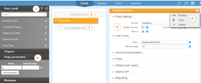
1 | Data Feeds | This panel lists the various feeds that you can configure and make available in the design of your application. Note: The search field at the top of the panel lets you search in all feed categories. When a query is launched the Data Feeds panel turns into a Search Results panel displaying all corresponding entries. |
2 | Feed drop zone | To add a feed, drag and drop it from the panel to the drop zone. |
3 | Subfeed drop zone | To add a subfeed, that is to say a feed depending on a parent feed, drag and drop it from the panel to the drop zone. |
4 | Feed properties | Each feed has a set of properties which define its behavior. For most properties, you can click in the field to display a contextual menu listing all available Values and MEL Functions on the left. |
5 | Feed tools | To disable, copy or delete the feed. |
6 | Page Parameters | To declare reusable parameters for your page. Once declared, parameters are available in the Values tab of the contextual menu which opens when you click in the Feed properties fields. You can notice that by default: The index page does not contain any parameters. As it is the required home page of the search application, this page is static. Unlike the index page, the search page is dynamic and takes a parameter q (our query). Note: In your Mashup Builder, you can notice that the page parameter is shown in the URL field, between a question mark and an equal sign. For example, search?q= means that on the search page, the q parameter is passed with the value defined after the = sign. You will also frequently see several page parameters in URLs, separated by ampersands (&). |
No. | Element | Description |
|---|---|---|
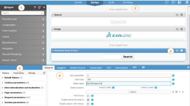
1 | Widgets | The Widgets panel contains many standard widgets grouped by categories. You can easily drag and drop widgets on the Design view to create your own page(s). To configure a widget, you must define its properties (see No. 4). The search field at the top of the panel lets you search in all widget categories. When a query is launched the Widgets panel turns into a Search Results panel displaying all corresponding entries. For widget descriptions, see the Widget Reference. |
2 | Widget drop zone | To add a widget, drag and drop it from the panel to the drop zone. |
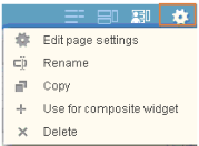
3 | Widget tools | To edit the widget properties, annotate the widget title, use the widget to create a composite widget, and disable, delete, copy or delete the widget. |
4 | Widget properties | To configure a widget, just click its header. A panel opens at the bottom of the screen to let you define the widget properties. For example, in a search form, the main properties are: Input parameter: Parameter name of the input search form that will be sent to the action page (just like in a standard HTML form). Action: Name of the page where the form should send parameters. If you click on the field, you will see a list of possible values (pages) on the left. |
5 | Contextual menu | Provides the available widget configuration options depending on the content of the option (for example, when a facet is required, it will list the available facets for the selected feed(s)). |
No. | Widget | Description |
|---|---|---|
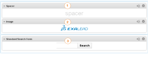
1 | Spacer | An empty block to center the search form with the logo. |
2 | Image | Exalead logo. |
3 | Standard Search form | Our standard search form made of a free-form field and a Search button. |
No. | Widget | Description |
|---|---|---|
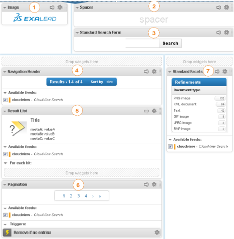
1 | Image | A small Exalead logo. |
2 | Spacer | An empty block to center the search form. |
3 | Standard Search form | Exactly the same search form as on the index page. |
4 | Navigation Header | Our first dynamic widget, displaying information on the number of hits and on the number of pages. |
5 | Result List | A dynamic widget displaying the hits (results) of the feed, in our case the CloudView Search feed. |
6 | Pagination | Displays the pagination for the given feeds, in our case the CloudView Search feed. |
7 | Standard Facets | The refinements widget that is configured to display facets from the feed, in our case the CloudView Search feed. |
No. | Element | Description |
|---|---|---|
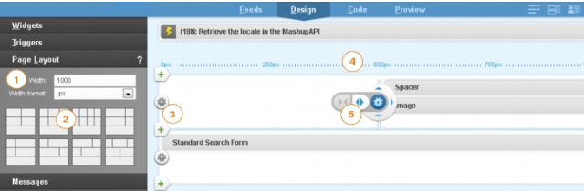
1 | Width and width format | Specify the width and the width format (pixels or percentage) of the page. |
2 | Predefined Layouts | You can select between a variety of different row layouts depending on your needs, or use the row tools (3 & 5) to add cells above or below. |
3 | Add row (+) | To add a row below. |
4 | Horizontal ruler | This ruler allows you to measure the widgets’ width. The units of measurement are expressed in pixels or percentage, depending on the selected Width format. |
5 | Cell designer | The cell designer allows you to split or merge the current cell. |
No. | Element | Description |
|---|---|---|
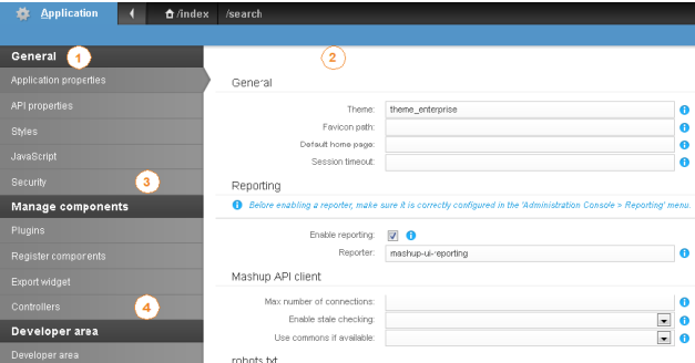
1 | General tools | These tools allow you to parameter general settings for your mashup application. You can: • Tune the overall look and feel, reference CSS and javascript. • Set up security. |
2 | Application Properties view | You can configure applications properties to control the behavior of your current application. For example, you can specify the default home page of the application, the icon to display in the URL bar (favicon), the theme to use, etc. |
3 | Manage components | Mashup Builder Premium gives you the possibility of adding plugins for feeds, widgets and triggers. You can therefore install and deploy custom components on your applications. |
4 | Developer area | The Developer area includes several tools that can be useful to develop and debug your own search applications. For more information, see "Using Developer Tools" in the Exalead CloudView Mashup Programmer's Guide. |