When you have very specific needs, you can create your own Composite Widgets with the standard widget library. Your composite widgets will be added to the Widgets >Composite Widgets group.
Inside your composite widgets, you can also create your own widget properties and therefore configure your custom widget from A to Z.
It is also possible to create a composite widget out of:
• a page and reuse that page as a widget in other pages,
• an existing widget.
Note: A composite widget is actually a plugin. Once created, you can export and import it like any other plugin.
Add and configure your form composite widget on a page
1. Once your composite widget is saved, close the Widget properties panel to return to the main Design view.
2. Select the page on which you want to add your composite widget.
3. From the Widgets > Composite Widgets group, select your Company Form composite widget, and drag and drop it on the canvas.
4. From its properties panel, select the page that will display the search results of your form from the Action property.
5. Select the Feeds view and edit the feed called by the composite widget to define the behavior of the query so as to search after the start date and before the end date delimited by the two datepickers.
a. Select the feed called by the widget and expand the Advanced parameters section.
b. In the Query restrictions field, restrict the query to use the span of time between your startdate and enddate datepickers: after:${page.params["startdate"]}before:${page.params["enddate"]}
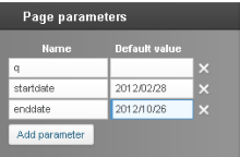
6. From the Page parameters panel create two page parameters for startdate and enddate and choose their default values. The time format of these dates is YYYY/MM/dd.
7. Select the Preview to check your configuration changes.
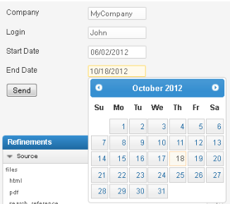
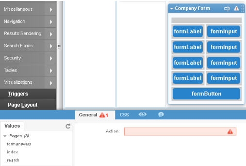
You should now see the composite widget on your Mashup Builder page, and be able to complete the form. See Figure 12.
You can use the datepickers to filter the search results.
8. Click Apply.
Figure 13. Form composite widget to refine the page results
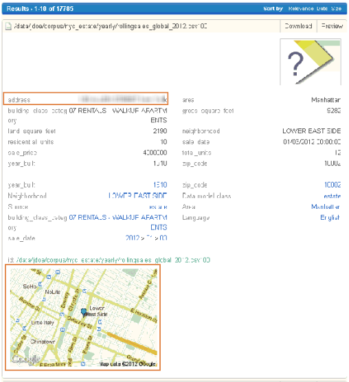
Link addresses to static Google Maps
The following use case describes how to proceed if you want to link postal addresses to static Google Maps in a result list. Each address will be displayed as both text and image, as shown in .
Create a composite widget linking addresses to static images
This example requires that an address meta is defined in your data model.
1. In Mashup Builder, select a page, for example /search, and select the Design view.
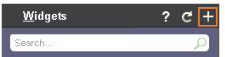
2. In the Widgets panel header, click the + sign.
3. In the Widgets properties panel:
a. Fill in the Name field, for example Static Google Map.
b. Enter a description (optional).
c. For Feeds, define how the widget supports feeds by selecting a cardinality, for example ONE.
d. Select the platforms for which the composite widget will be available, for example WEB.
e. >For Enclosing tag, select the type of enclosing tag used by the widget, for example div.
4. Click Add widget property and create the three following properties in the General tab.
Property
Options to configure
Address
Id: address
Name: Address
Arity: ONE
Description: Meta(s) containing the address to position the marker
Is evaluated
Check functions: isEmpty()
Context menu functions: Metas()
Display functions: SetType('code', 'js')
Height
Id: height
Name: Heigth
Arity: ONE
Description: map height (in pixels but without px extension)
Check functions: isInteger()
Display functions: SetType('number')
Width
Id: width
Name: Width
Arity: ONE
Description: map width (in pixels but without px extension)
Check functions: isInteger()
Display functions: SetType('number')
5. From the Widgets panel, drag and drop an HTML widget.
6. In the HTML code field, enter the following code:
◦ Variables made with the custom properties created in step 4 (option.width, option.height, option.address). They are used to configure the width and height of the image, and the address display in the widget.
◦ A call to the Google Maps api.
◦ A command to center the address in the static map.
◦ A command to add a blue marker to flag the address in the static map.
Add and configure the static Google Map composite widget
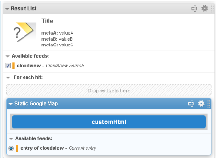
We are now going to add the composite widget within the Result List widget to get one image per result. If you do not nest the composite widget within the Result List widget, you will get an image for the first result only.
1. Once your composite widget is saved, close the Widget properties panel to return to the main Design view.
2. Select the page on which you want to add your composite widget, for example search.
3. From the Widgets > Composite Widgets group, select your composite widget Static Google Map, and drag and drop it within the Result List widget.
4. Click the widget header to open its properties panel, and for the Address property, enter: ${entry.metas['address']} to link the widget to the address meta of the Result List widget.
5. Select the Preview to check your configuration changes.
You should now see the composite widget as it will be displayed on your Mashup Builder page. Each result in the result list displays the postal address as test and the location of this address on a static Google Map.
Figure 14. Postal address linked to static Google Map
6. Click Apply.
Create custom widget properties
While creating/editing a composite widget, you can also create the properties and the tabs that will be available in the widget’s configuration panel when this widget is added to a page.
To do so, you can click the Add widget property button and then click:
• Create property to create new properties, as described in the following procedures.
• Create new property group to create a new tab in the panel.
Create a custom widget property
1. In the Widget properties panel, click the Add widget property button to create a custom widget property.
The Add widget property panel opens at the bottom of the screen.
2. Click Create property and set the options as described in the following table.
Add widget property panel description
Option
Description
ID
Enter the ID of the widget property.
Name
Enter the name of the widget property.
Arity
Specify the arity of the widget property. The arity is the number of arguments that the function takes.
• ONE: For unary operator
• ZERO_OR_ONE: For binary operator
Description
Enter a description for the widget property.
Placeholder
Specify the placeholder to display to help the user completing the property field. The placeholder disappears as soon as you enter text.
Possible values
Define the property’s values:
If one value is declared, it will behave as a default value.
If several values are declared, a selection box will be displayed.
Is evaluated
Choose whether the widget property will be evaluated and have MEL expressions or not.
Is xml escaped
Choose whether the widget property results will be XML escaped or not, that is to say whether ASCII characters like the angle brackets (<>) will be encoded in XML.
Is url encoded
Choose whether the widget property results will be URL encoded or not.
URL encoding is normally performed to convert data passed via HTML forms, because such data may contain special characters which are not allowed on a valid URL format.
Check functions
Choose an error checking function to validate user input:
• isInteger: Checks that the value is an integer and displays an error message if not.
• isAlphanum: Checks that the value is a chain of alphanumerical characters and displays an error message if not.
• isPageName: Checks that the value is a page name and displays an error message if not.
• isEmpty: Checks that the value is NOT empty and displays an error message if it is the case.
Context menu functions
Specify the types of functions that will be available in the Value tab of the contextual menu displayed on the left of the widget properties panel:
• Aggregations(): Gets all facet aggregations, for example, count, score etc.
• DateFacets(): Gets all Date facets from the feeds used by the widget.
• Eval(): Gets all possibilities evaluated by the widget. The possible attributes are: facet, category and meta.
• Facets(): Gets all facets from the feeds used by the widget.
• Feeds(): Gets all the feeds used by the widget.
• Fields(): Gets all the virtual fields, numerical fields and RAM-based fields from the feeds used by the widget.
• GeoFacets(): Gets only Geographical facets from the feeds used by the widget.
• Hierarchical2DFacets(): Gets only Hierarchical2D facets from the feeds used by the widget.
• Metas(): Gets all metas from the feeds used by the widget.
• MultiDimensionFacets(): Gets Multi-dimension facets from the feeds used by the widget.
• Normal facets(): Gets only Category facets from the feeds used by the widget.
• Numerical facets(): Gets Numerical facets from the feeds used by the widget.
• appendOnChange(', '): A click of the user on a dynamic list, will append the given string after the current option value.
• emptyOnChange(): A click of the user on a dynamic list, will remove the current option value before setting the clicked value.
• PageParameters(): Gets the page parameters names
• Pages(): Gets the names of available pages.
• Sorts(): Gets all the feed elements that can be sorted.
• WUIDS(): Gets the list of this page Widget’s unique IDs.
Display functions
Specify how the property will be displayed. For example, you can force the property to act as a select box, force it to act as an input (default is Text area), force it to act as a password input, etc.
• Code Editor: Transforms the property's input field into a code editor
• Number: Transforms the property's input field into a number input field.
• Password: Transforms the property's input field into a password input field (encrypted).
• Radio: Transforms the property's input field into a radio button.
• SetHeight: Sets the minimum height (in terms of lines) of the option's input field.
• TextEditor: Transforms the property’s input field into a rich text editor.
• TextArea: Transforms the property's input field into a text area field.
• ToggleDisplay: Shows/hides properties conditionally depending on the selected property value. For example, value1 of PropertyA will display PropertyB and PropertyD, value2 will display PropertyB and PropertyC. You need to set:
◦ the value to match (using the valueToMatch and ifEquals attributes)
◦ the options to hide (in hideOptions)
◦ the options to show (in showOptions).
3. Click Save.
Use case: Create an Action widget property to reach pages in a Form
To give a simple example of widget property creation, we are going to create an Action property that will be available in the contextual menu to select an application page.
1. Click the Add widget property button to create a custom widget property.
2. Click Create property and configure the widget property as follows:
a. For ID, enter action
b. For Name, enter Action
c. For Check functions, select isEmpty() to check that the value is NOT empty.
d. For Context menu functions, select Pages().
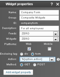
3. Now if we go back to the use case described in Create a custom form, for Widget properties > Action we can select %{option.action} to use the newly created widget property.
4. Go to the page where the composite widget is added and click its header.
The widget properties panel opens and you can now see the Action property.
5. Click in the Action property field.
The contextual menu displays the application pages that can be used as destination pages when the form is submitted.
6. Select the destination page you want to link for your custom form, for example formanswers.
Create a composite from a page or widget
You are not forced to create a composite widget from scratch. You can also create a composite widget from a page and reuse that page as a composite widget in other pages, or from an existing widget and reuse it as a composite widget.
Create a composite widget from a page
1. In Mashup Builder, select a page, for example /search, and select the Design view.
2. From the page editing tools, select Use for composite widget.
3. In the Widgets properties panel:
a. Fill in the Name field, for example MyWidget.
b. Enter a description (optional).
c. For Feeds, define how the widget supports feeds by selecting a cardinality, for example ONE.
d. Select the platforms for which the composite widget will be available, for example WEB.
e. For Enclosing tag, select the type of enclosing tag used by the widget, for example div.
4. If necessary, add widget properties to your composite widget.
5. Click Save.
Create a composite widget from a widget
1. In Mashup Builder, select a page, for example /search, and select the Design view.
2. From the widget header, click the edit widget properties icon, and choose Use for Composite Widget.
3. In the Widgets properties panel:
a. Fill in the Name field, for example MyWidget.
b. Enter a description (optional).
c. For Feeds, define how the widget supports feeds by selecting a cardinality, for example ONE.
d. Select the platforms for which the composite widget will be available, for example WEB.
e. For Enclosing tag, select the type of enclosing tag used by the widget, for example div.
4. If necessary, add widget properties to your composite widget.
5. Click Save.
Delete a composite widget
As previously stated a composite widget is a plugin. To delete a composite it widget you need to remove it from the list of plugins.
1. In Mashup Builder, click the Application button at the top left of the screen.
2. In the Manage plugins panel, select Plugins.
3. From the list ofplugins, click the delete action at the right of the screen for the composite widget you want to delete.
The composite widget is removed from the list and from the Widgets panel.


 icon, and choose Use for Composite Widget.